I was stitching a teaching piece recently, and just wasn’t liking the colors I was using. I was happy with them when I picked them out, but the actual stitching with them wasn’t going the way I planned. Among the threads I had selected was a neutral, ecru, in several different weights. In desperation I decided to add the neutral. And voila! The project I was hating turned into something I was loving.
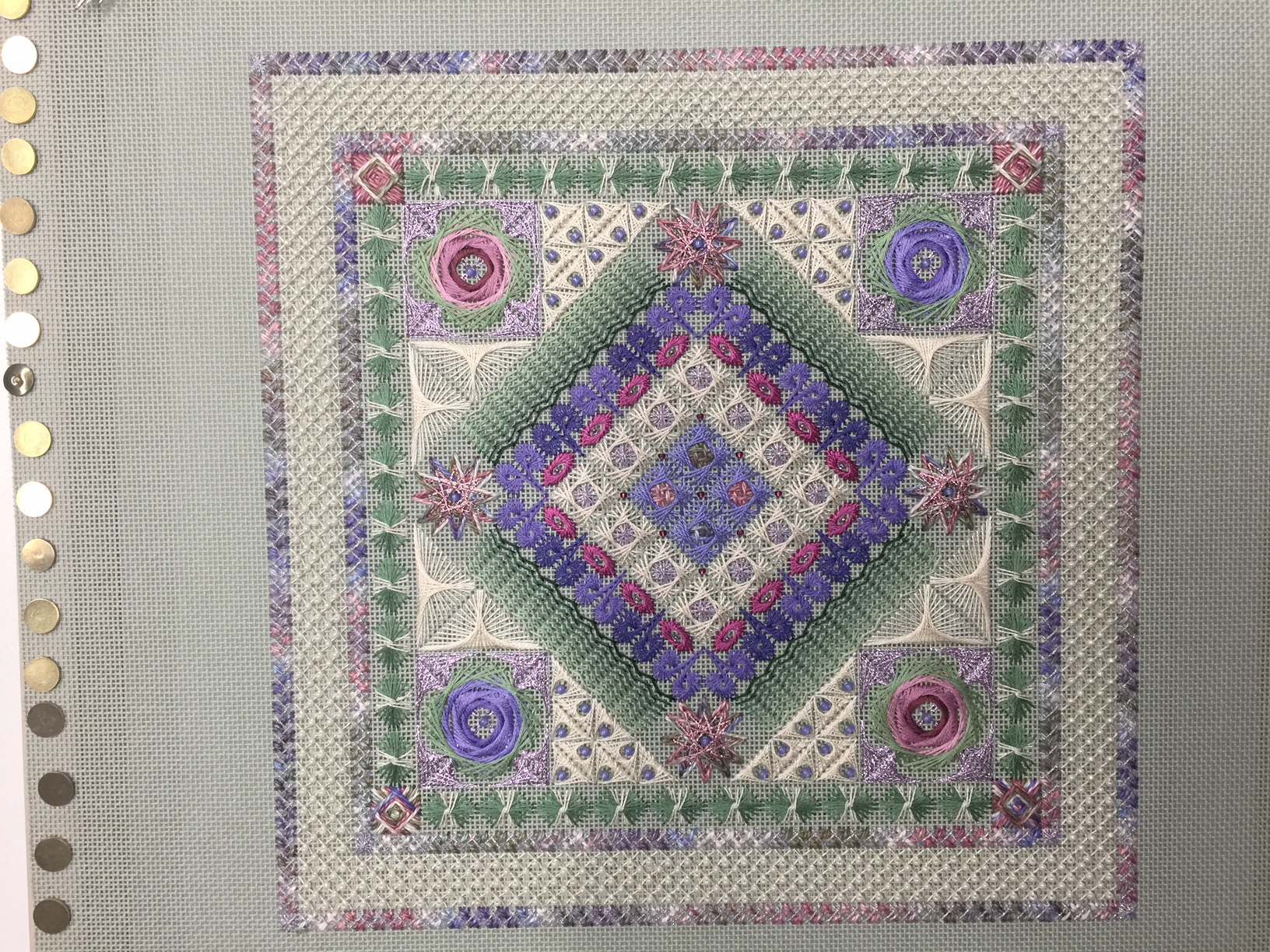
This is not the beauty shot that Rod takes after the piece is framed, but just a quickie I took, so it’s a little out of focus. But not so out of focus that the colors aren’t readily visible, and that’s what I’m talking about here.
I had stitched the center part, including the ecru band around the center, and was working on the outer edges past the green borders around the center. That’s where I was having trouble deciding what to use. So I used the ecru pearl cotton to stitch the Amadeus stitches that form the triangles, and the piece went from “blah” to “wow!”
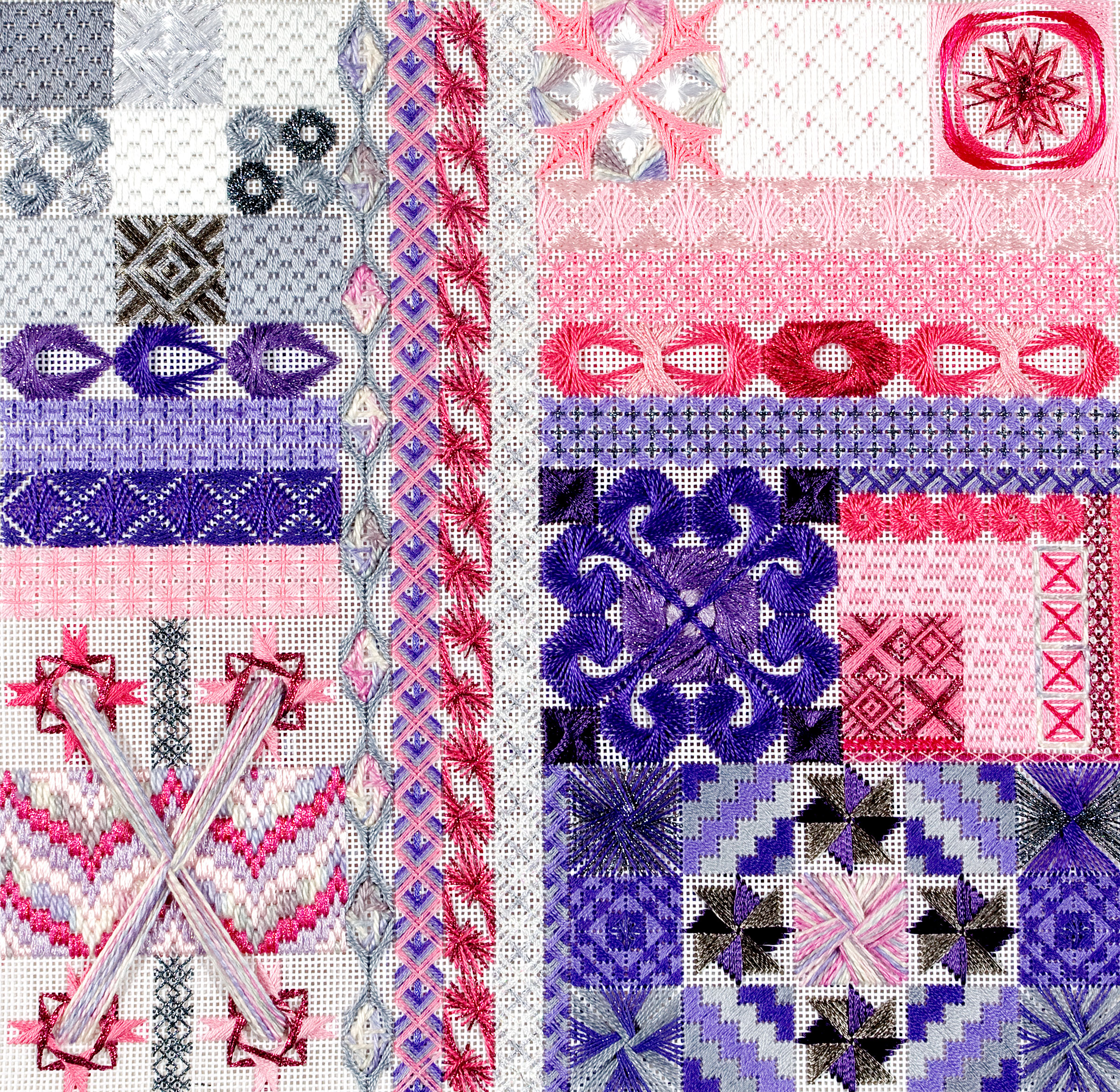
It’s interesting how color affects a piece. I have a project that I love, and I loved the colors as well, but it hasn’t attracted any interest from selection committees. I’m going to restitch in different colors to see if that helps the design take off.
Here’s Symphony in the original colors:
And here are the colors I’m going to use to restitch it:

Of course there are more threads that I’ll be using, these are just what I’m basing the palette on. I’ll keep you posted – we’ll see how the project looks in different colors!